Create Logos That Breathe — Imagining Living Identities in the Age of AI
There’s something quietly unnerving and exhilarating about a mark that doesn’t sit still. A coffee shop logo that flushes warmer when someone orders, an indie label glyph that slightly stutters when a track skips, or a local co-op crest that grows a tiny leaf each time a new member joins — these are logos that breathe. If you want a quick taste of that living logic, try seeding a melody, texture, or mood into Dreamina’s AI photo generator and watch the machine return visuals that feel atmospheric and animate-able. Those mood plates are excellent reference points when you’re trying to imagine a mark that behaves like a creature rather than a stamp.
This piece is part imagining, part practical sketchbook. We’ll listen to what a living logo might care about (mood, context, tempo), imagine small systems that let marks change without losing identity, and walk through a tight Dreamina workflow so you can prototype a breathing mark before you build the tech to animate it for real. Expect short paragraphs, a few compact bullets, and playful examples you can riff on.
Why a logo might need to be alive
A living logo is not a gimmick. It’s a tool for signaling context and deepening emotional connection. Instead of one static shape that must mean everything, a living system allows a brand to be gentle and nuanced: calming when the app detects stress, playful during celebrations, or solemn when the world needs quiet. This flexibility gives brands personality that scales across screens, spaces, and physical objects.


What to listen for before you design
Treat the brand like an organism. Ask three quick questions before you sketch: what state changes matter (time of day, emotional signals, user milestones)? which behaviours are helpful (pulse, color shift, gentle morph)? and what must remain stable (core shape, brand mark, legibility)? Answering these narrows the design playground.
- Keep a single invariant: one stroke or core silhouette that never changes
- Pick two mutable axes: color and micro-motion are low-cost, high-impact choices
- Decide on triggers: time, user action, weather, or sound
These rules will keep the breathing charming and not chaotic.
Micro-motions that feel alive (and don’t annoy)
Motion is seductive but can quickly become noisy. The best living marks use micro-motions — subtle shifts that are almost subliminal. Consider:
- A slow, 2–3 second inhale/exhale that slightly expands and contracts the mark
- A soft hue tilt on particular events (green warmth for “success,” slate for “loading”)
- A tiny nudge on interaction, like the dot moving a millimeter when tapped
Micro-motions are accessible: they translate well to social avatars and hardware LEDs, and they preserve legibility at small sizes.
Mood as a design parameter
Think of mood as a fourth color. Instead of designing dozens of separate logos, design a voice with tone presets: restful, excited, supportive. Each preset tweaks a handful of parameters (saturation, pulse rate, a small glyph flourish). This keeps the system coherent while expressive.
Making living identities work in the world
A living identity needs rules for deployment. Create a simple state map: idle, active, celebratory, and error. For each state, define: motion intensity, color shift, and any optional element (a sprout, a spark). Keep transitions slow and graceful so they feel organic, not robotic.
Also plan fallbacks: static images or reduced motion modes for accessibility. Living identities should never sacrifice clarity or inclusion for spectacle.
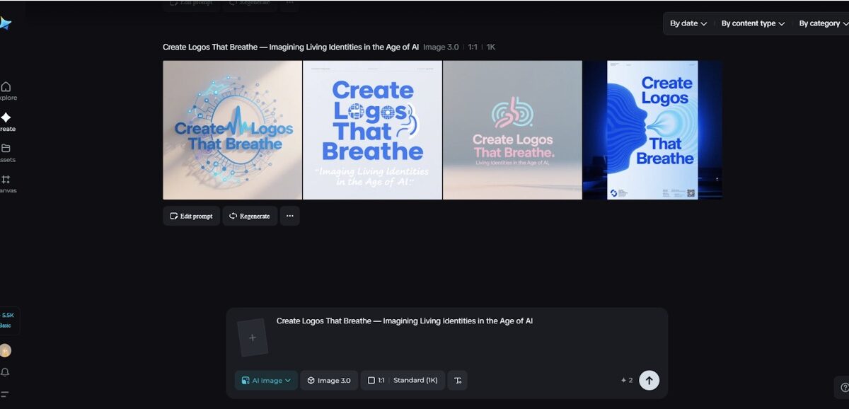
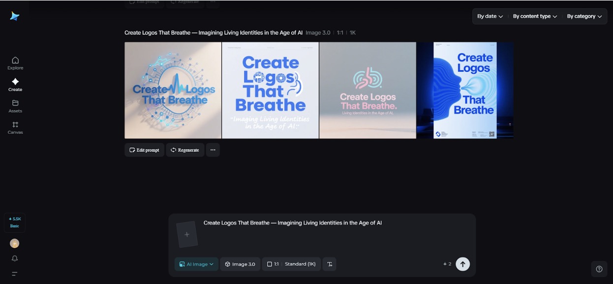
Dreamina’s way of making logos a reality
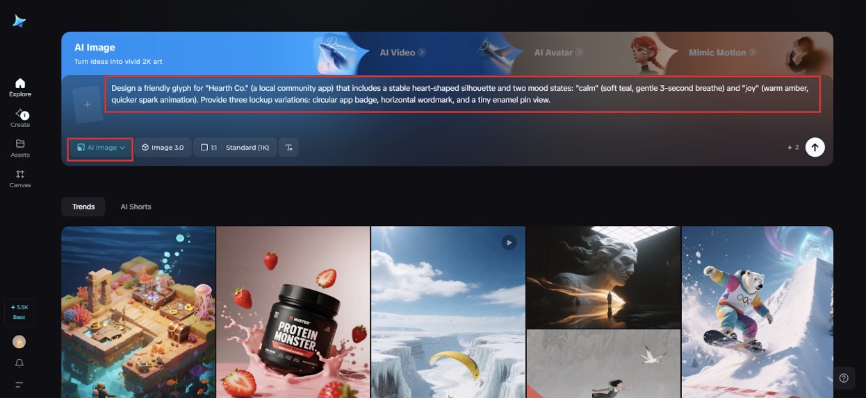
Step 1: Write a detailed text prompt
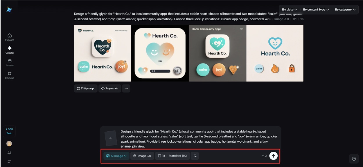
Navigate to Dreamina and write a detailed text prompt describing the brand, the key mood states, and the physical contexts you care about.
For example: Design a friendly glyph for “Hearth Co.” (a local community app) that includes a stable heart-shaped silhouette and two mood states: “calm” (soft teal, gentle 3-second breathe) and “joy” (warm amber, quicker spark animation). Provide three lockup variations: circular app badge, horizontal wordmark, and a tiny enamel pin view.
Be specific about mood, materials, and the living behaviors you want visualized.
Step 2: Adjust parameters and generate
Choose a model tuned for emblem and texture iteration, set an aspect ratio that fits each lockup, pick size, and select resolution—use 1k for fast exploration or 2k for cleaner mockups. Click Dreamina’s icon to generate multiple variations. Review them for silhouette stability and which concepts lend themselves to subtle motion cues.
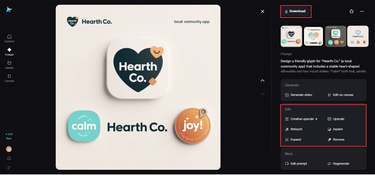
Step 3: Edit and download
Use Dreamina’s inpaint, expand, remove, and retouch features to refine your favorite concept. Tidy counters, expand compositions into mockups for app icons and enamel pins, remove visual noise, and retouch color to ensure accessible contrast. When the suite feels coherent and alive, click the Download icon to save high-resolution assets for animation and physical prototyping.
Prototypes before production
You don’t need sensors and firmware to start. Mock behaviors as short GIFs or Lottie animations and test them with real humans. Ask viewers whether a pulse feels friendly or frantic. Use small, iterative feedback loops to tune amplitude and cadence before anyone writes code.
When marks need a family
A living primary mark can have tiny relatives: an app icon that breathes, a website header that shifts hue, and a physical enamel pin whose enamel changes with heat. For rapid ideation of different lockups and glyph variants, a quick pass through Dreamina’s AI logo generator can supply many starting shapes to animate. Pick a few promising glyphs and then focus on breathing choreography.
Stickers, patches, and the tactile life of marks
Physical extensions of living logos are deliciously paradoxical: how does a breathing mark translate to a static sticker? The answer is narrative. A sticker can depict the mark in a “captured” pose — a smiling frame, a mid-inhale still. Create printed sheets that show the logo in multiple frames like a flipbook; when people peel and arrange them, they reanimate the mark. Also consider temperature-sensitive finishes or lenticular prints for low-tech movement. Dreamina’s sticker maker helps realize these tactile experiments quickly, so you can test which physical tricks feel like they honor the brand’s living logic.
Data, ethics, and gentle signals
A living logo often needs data. Be conservative and transparent: use non-invasive, user-consented signals (local time, in-app state) rather than ambient audio or unseen biometric streams. Design for privacy-first behavior: local state, ephemeral animations, and clear opt-outs. The mark should delight, not surveil.
Rapid creative prompts to try
- Imagine a charity’s logo that breathes softer as donation tallies rise; sketch the inhale amplitude at three donation milestones.
- Design a festival badge that opens a subtle starburst only at midnight; test with a 2-frame GIF.
- Create an app icon that lowers saturation gently during “focus mode” and pulses when notifications are muted.
These small plays reveal how living identities can be meaningful rather than decorative.
Testing and rolling out a breathing mark
Pilot the system in a contained environment: a beta app, a seasonal campaign, or a small store window installation. Monitor reactions, keep an accessible reduced-motion option, and gather qualitative feedback. Adapt triggers, colour, and pulse to human reactions rather than dashboard vanity metrics.
Closing — the brand that breathes with its people
Designing logos that breathe is an invitation to think of identity as a relationship rather than symbol. A living mark can reflect moments, comfort users, and make small rituals feel more resonant. Dreamina speeds up the imaginative lift—mood plates, lockups, and high-res mockups—so you can iterate before you animate. Try a soft prototype, test with empathy, and download your keeper.
When your logo finally inhales and the world notices, you’ll have built something quietly alive.